Design with ugly data
There is no shortage of beautiful, pixel-perfect design mockups on the web. dribbble is full of designs so good it’s intimidating. If a mockup seems too perfect to you, you might be right. Designs built only with “ideal content” in mind could break when faced with real texts and images. By designing with ugly data from the start, we can design more robust layouts.
You can spot an “unrealistically perfect” design if everything in it seems a little too neat. The name of every event shown in a mockup fits into exactly one line of text. Every photo shows a beautiful landscape and is well-lit. Authors have short names like “Jane Doe” and “Henry Smith”. Avatars show attractive people, never anime characters or a person’s black BMW. Comments and reviews begin with “Lorem ipsum”. Addresses are in cities with short names like Sydney or New York, never in San Pedro y San Pablo Tequixtepec, Pfaffenschlag bei Waidhofen an der Thaya, or Taumatawhakatangihangakoauauotamateaturipukakapikimaungahoronukupokaiwhenuakitanatahu.
Apple is as guilty of this as many of us. According to their product pictures, our albums are full of photos taken all over the world. We receive messages only from people with pretty contact photos. We always plan vacations, take yoga classes, and meet each other for coffee in the middle of the day. What’s going on in my phone tells a different story.
A beautiful design built with perfect content might not work with imperfect content. With user-generated content, we have little to no control over what ends up on our pages and screens. Many of those impressive mockups on dribbble would struggle with “real” content. We can reduce the risk of our designs showing those same problems by designing with ugly data from day one.
It is always best to use real content in our designs, or at least content that is as realistic as we can get. Lorem Ipsum is a bad alternative to actual content. Designing for bad content is as much part of a designer’s job as perfecting the ideal case. If you have access to real data, find a few options on the full spectrum from “perfect” to “terrible”. If that is not an option, take a few minutes to come up with realistic options along that same spectrum. Once you have a few real (or realistic) alternatives, check that they work in the same design. Repeat the same for every new information you need to add.
You do not need to use paragraphs of made-up text or photos of people you consider unattractive. There are other attributes that make content less than perfect. Texts could use complicated technical language or contain words that are very long. Photos could be badly lit, out of focus, or use an aspect ratio our design does not expect. Consider different options to find a design that can handle them all well.
Let’s assume we wanted to create a theme we could use for conferences. To keep it “flexible”, we use placeholder texts and images instead of the real thing:
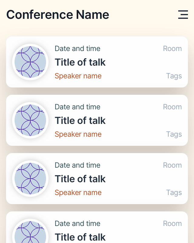
This empty layout looks modern and clean. Everything is in its place, and it has a bit of an Apple-y vibe to it. It breaks as soon as we add real, “ugly” data to it:

While the first one looks fine, everything else is terrible. Text is overlapping, to the point where many details become unreadable and inaccessible. This design does not work with real data. Now that we know what the content will look like, we can move it around a little to avoid those problems:

Only now that we use real data do we notice more flaws in our design. See how we show the same date on every card? Assuming this is about a multi-day conference, we can turn the date into a subheading. We still need the time of each talk, which we can now combine with the room attendees need to go to:

There is still more we could do. The point is that we can only tell what changes we need to make if we know what we want to achieve. Ugly data helps us see where our design could break and fix it.
If you have no way of knowing what kind of content is realistic, Sketch’s Data-feature is great. It replaces elements of your design with randomly generated content from different categories. This helps you replace fake avatars with real faces and texts with random names. You can find more “data suppliers” (as Sketch calls them) through their Plugins page.
I created a data supplier called “sketch-dadjokes”, which replaces texts with dad jokes. You can find it via the Plugins page or install it from the sketch-dadjokes repository on GitHub. While fun, it won’t help you fight the problem outlined here. It will still give your designs more character than Lorem Ipsum ever could.