Get better at design by breaking some designs
“Wow, that website is so pretty! I could never design something as pretty as this!”
Design can feel like a talent you’re either born with, or you’re not. Only a select few can make something look good, while we normal folk are doomed to make people’s eyes bleed forever.
Design is a skill like any other, which means we can learn and get better at it. I recommended some books for getting better at design before. You can also keep a list of well designed sites to use for inspiration.
Let’s look at that list of beautiful sites again. Without formal education, few of us could create something like them from scratch. Looking at pretty sites makes you as much a better designer as eating good food makes you a better cook. If you don’t try to learn what makes a design or dish work, you’re consuming without improving.
When we don’t know the process that went into a great result, all we can do is try to break it apart. If good artists copy and great artists steal, why shouldn’t new artists destroy?
“View Source” is still the most powerful learning tool for aspiring designers. It puts the ingredients behind great designs right at our fingertips. It gives us access to the entire recipe. We can change the recipe to find and understand the importance of each ingredient.
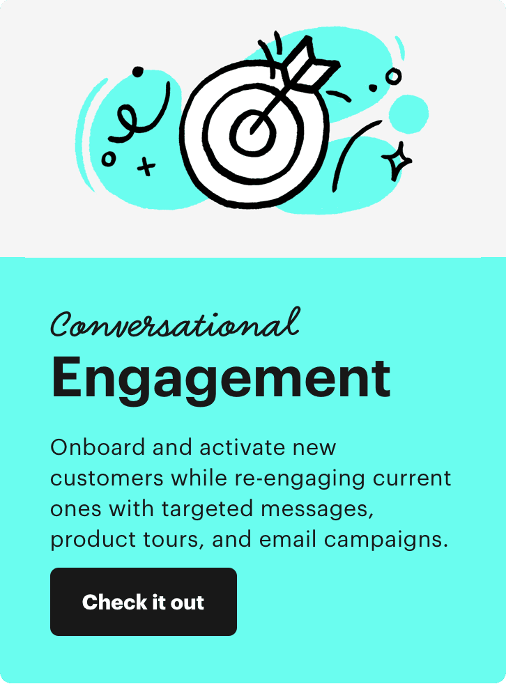
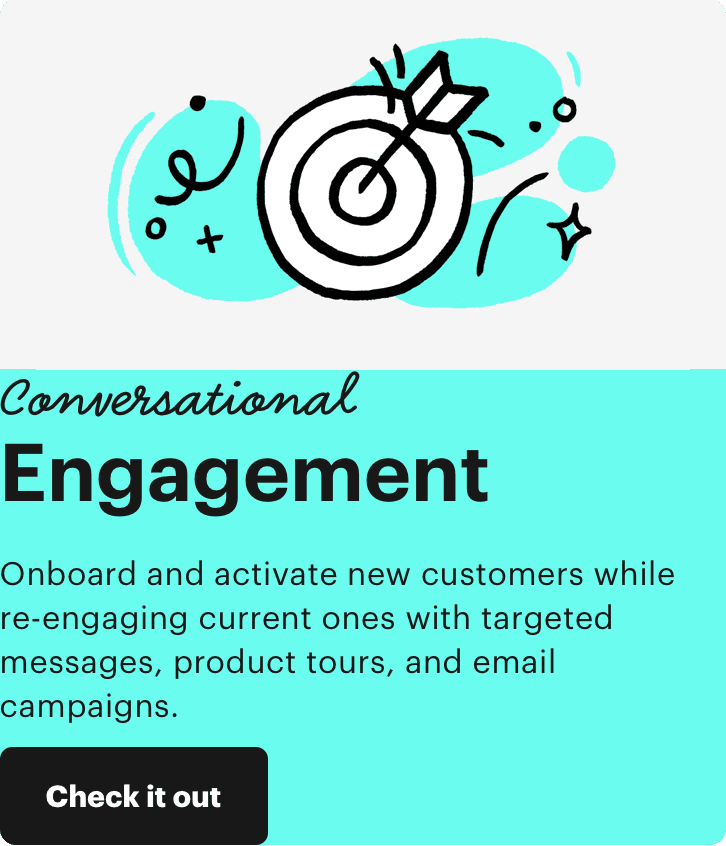
Let’s look at this section from Intercom’s homepage:
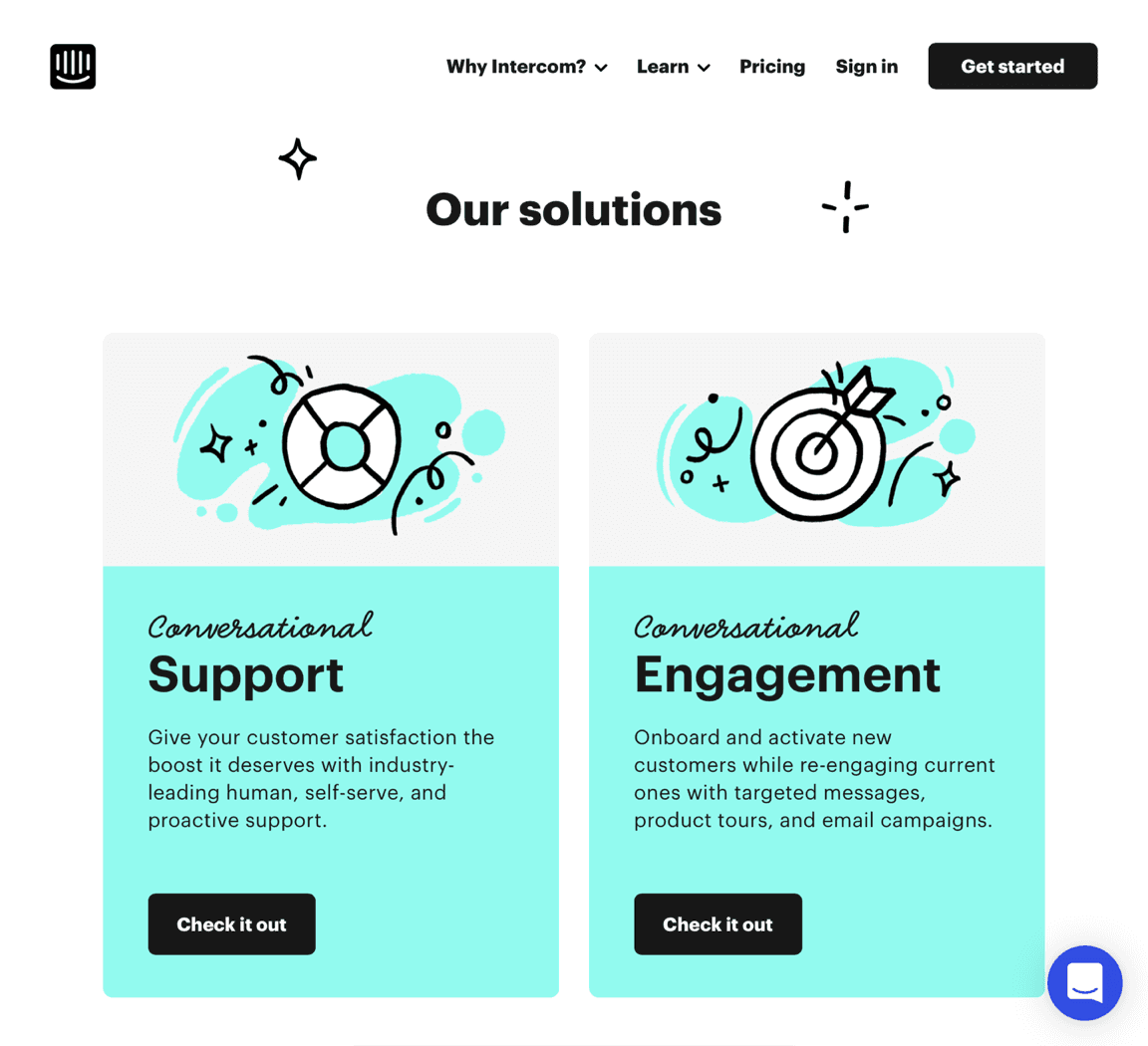
The cards have a very Intercom feel to them. They feel “designed”, but how? Why do they work? Let’s start by looking at this giant margin between the text and the button.
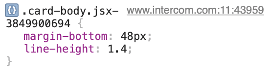
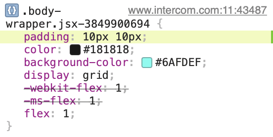
Those 48 pixels sound like a lot. Let’s remove them.
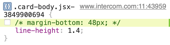
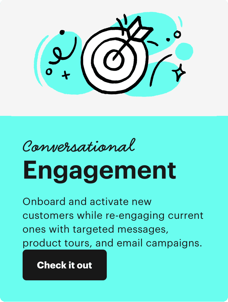
Much worse. How about 10 pixels instead?
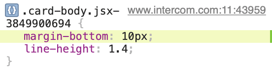
That’s not very good either. Now that we know what it looks like without this large margin, we can see that it was a good idea in the first place. Let’s look at all this padding around the content next.
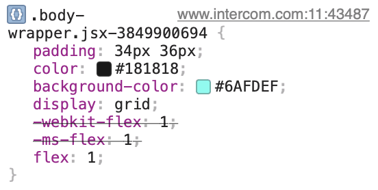
Why do they use 34px on the vertical and 36px on the horizontal axis? Why not use 35px for both? I don’t know, but isn’t that interesting. Assuming this wasn’t an accident, someone made this choice intentionally. Huh.
Let’s remove it.
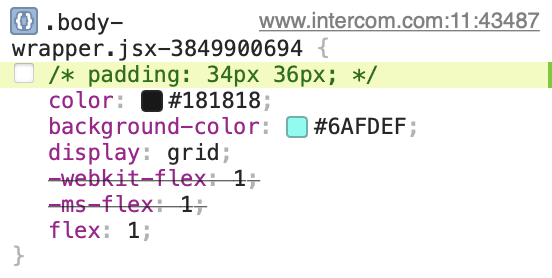
That’s not good at all. Let’s try 10 pixel instead.
Next, how about that part of the heading that says “Conversational”? If uses the typeface Smile Script. Let’s turn that off.
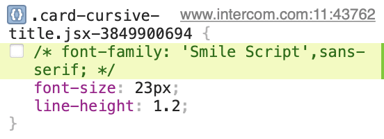
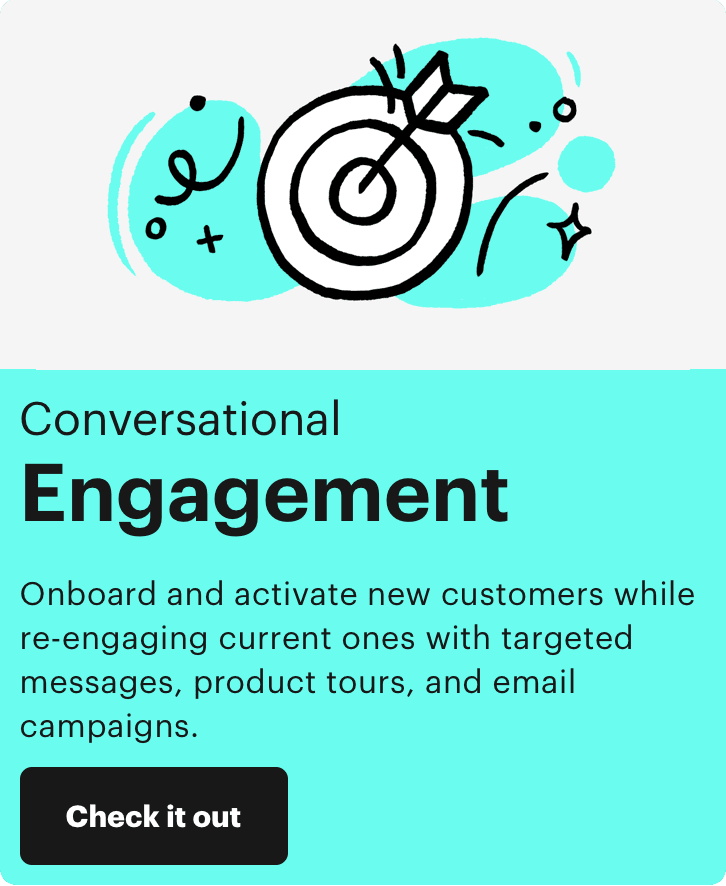
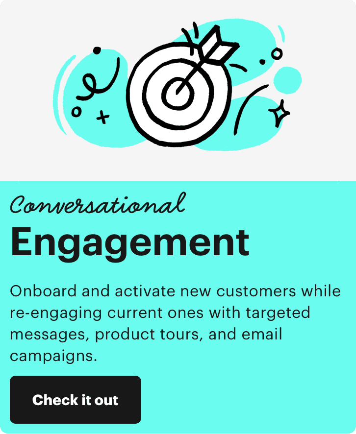
Wow, that is much worse. Turns out the typeface was essential for giving the cards their tone.
We could continue this exercise for hours. Along the way, we try to understand all the otherwise invisible details that make the design work. By breaking parts of it, we learn how each of the thousands of tiny decisions support the design. Over time, patterns like the uneven padding on the cards’ body emerge. When we need to design something, we can use the tricks we learned exploring a finished design in our own work.
Web development is one of the areas you can still learn directly from other great designers. Next time you find a pretty site, try to break it. Turn it into something ugly. If you want to become a better designer, being destructive can teach you a whole lot.