The constraints behind consistent icons
I announced Lovelicons as a set of “200+ icons” when all I had was about 70 good ones. Before I can release the set, it needs to live up to that initial promise. Luckily, many of the missing icons are easy to create. As I am drawing them, I still need to make sure they look like they belong together.
The icons need to share a style to feel like a complete set. In this week’s issue, I’m sharing some of the constraints I use when drawing icons that I want to look similar.
Size
I draw all icons on a canvas of 24×24 pixels. The outer 2 pixels are a reserved zone that most icons don’t reach into, leaving them a 20×20 pixel “safe zone”. Many icons don’t even need that space.
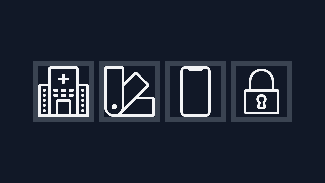
Sometimes, an icon needs that little extra bit of space to work well. If a detail would not work inside the safe zone, the icon can reach beyond it. Ideally, only a few minor details make it outside of the safe zone:
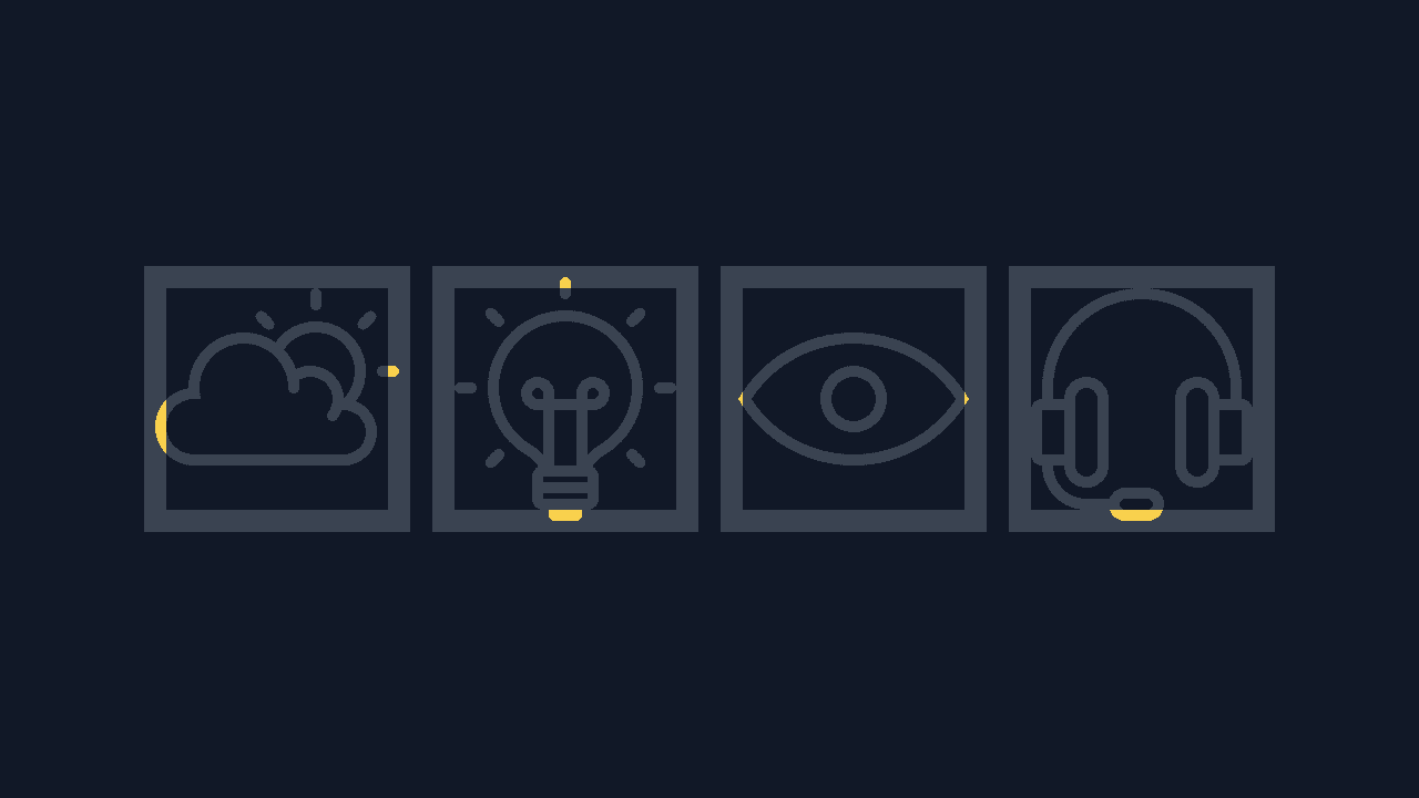
It’s rare for icons to break out of the safe zone. I find it helpful to have that little bit of extra space when I need it, but I try to avoid it as much as I can.
Border radius
A big part of what makes the icons look similar are the rounded corners. The edges are slightly rounded off, with either a 1px or a 2px radius. With sharp corners, the set would give off a different vibe:
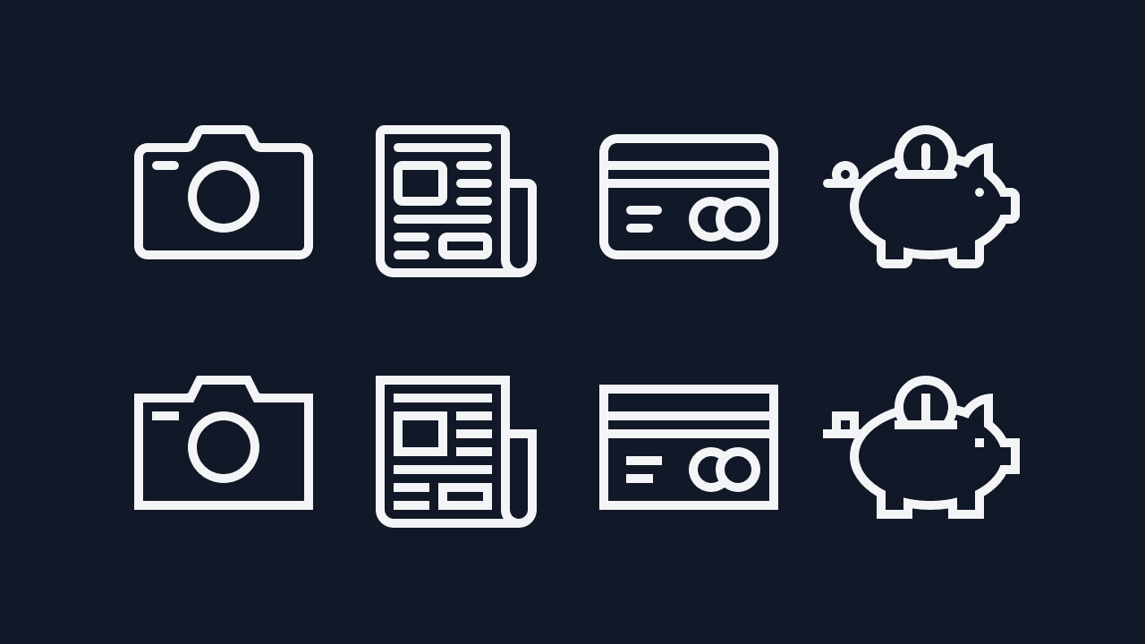
The difference between these two versions is minimal:
Both of these styles are fine. The rounded corners help give the icons the softer tone I am going for.
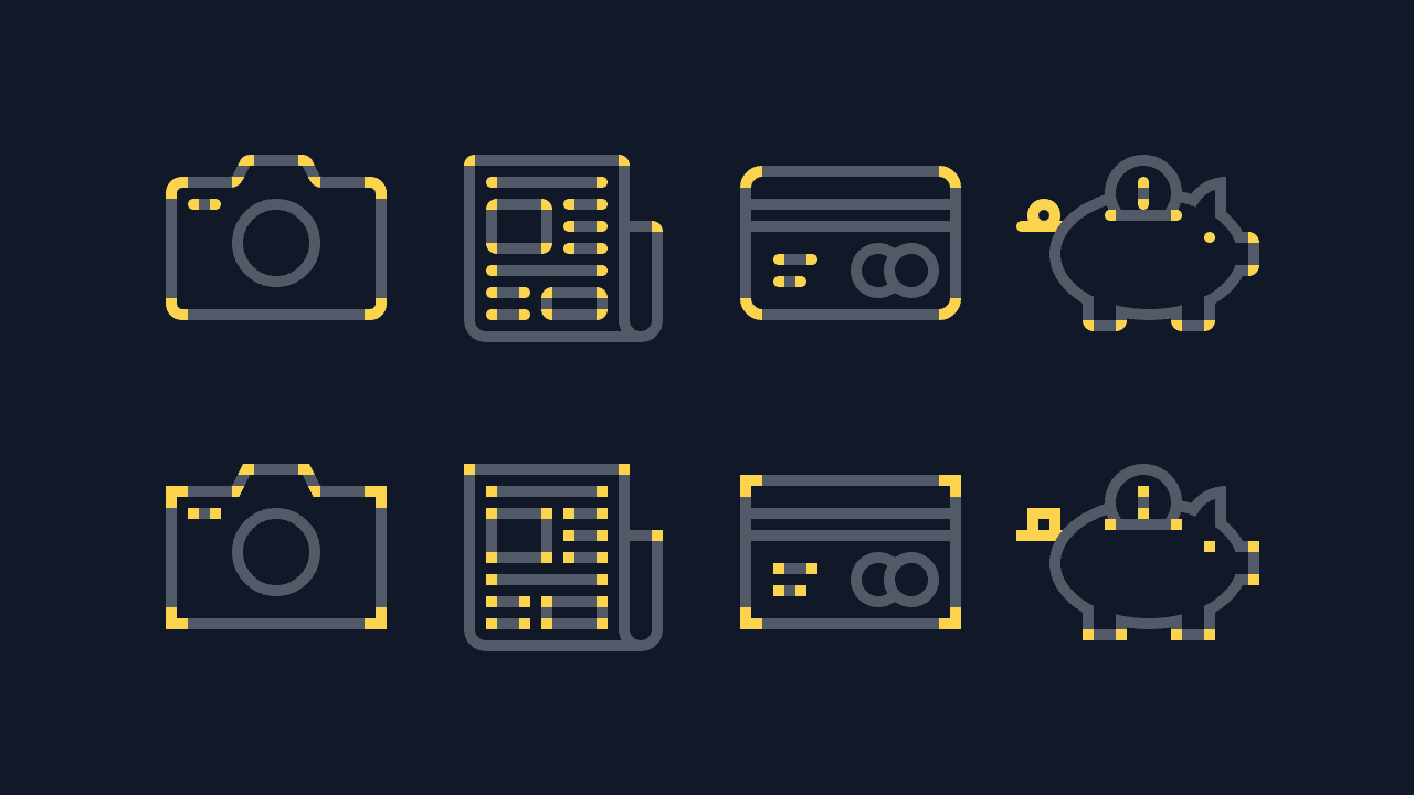
Picking the right border radius goes a bit beyond that, even. Some icons I brought in from abandoned projects also rounded the inner side of a corner. It’s not noticeable at small sizes, but becomes more obvious at larger sizes.
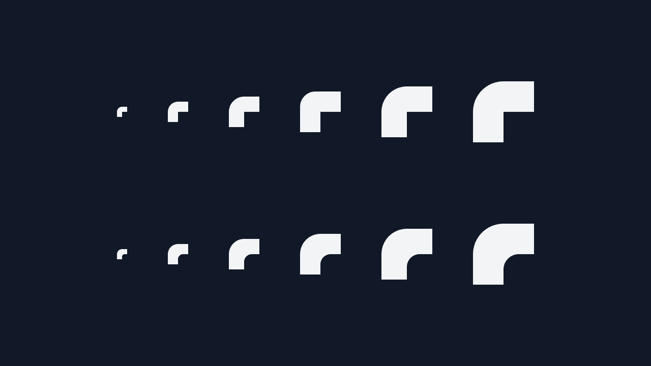
It’s all about consistency. If only a few icons round the inside of a corner, they look out of place. As I’m writing this issue, I’m noticing that some icons still have the inner radius. I will remove those before the set launches.
Remixed elements
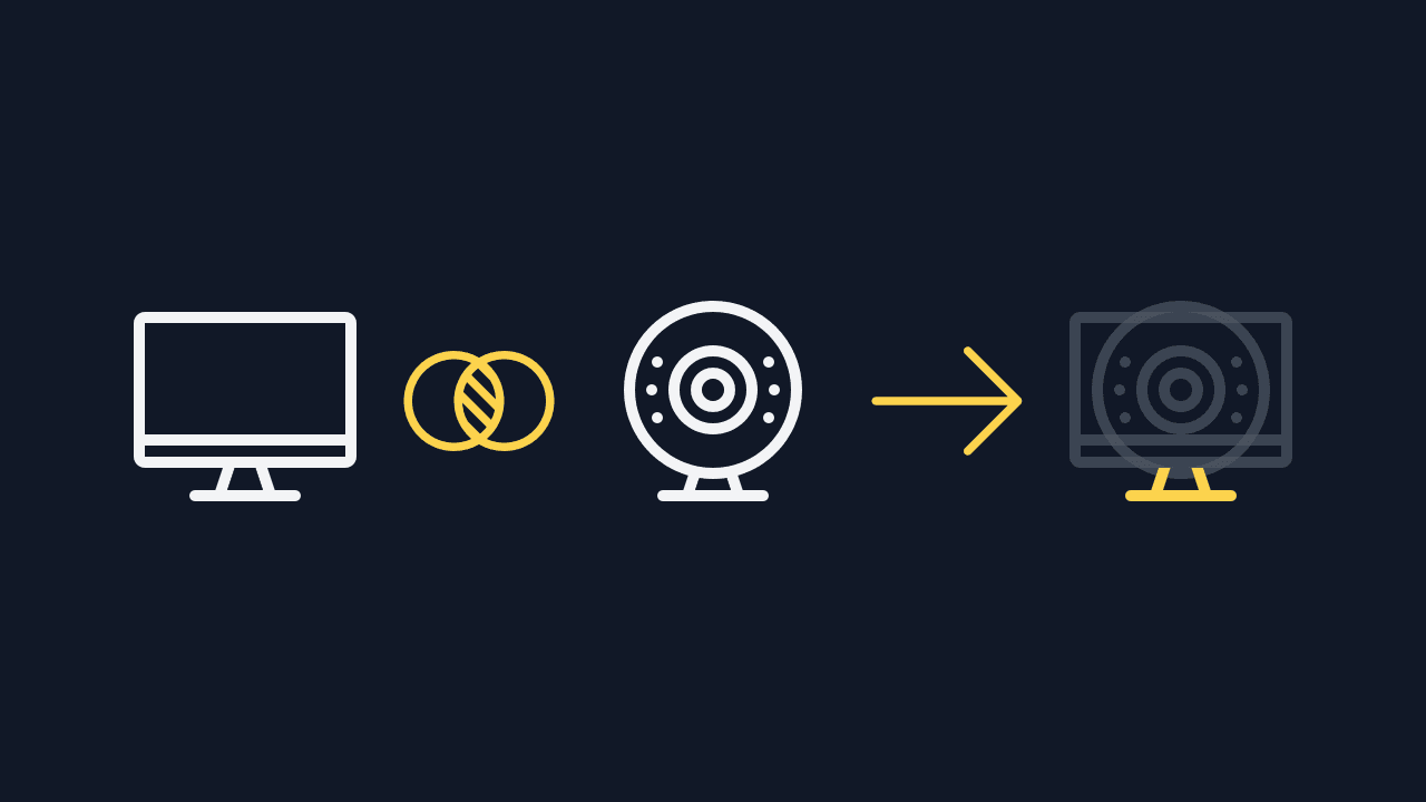
The biggest shortcut to fitting new icons into the set is to remix parts of existing icons into new ones. The desktop computer and webcam share the same stand, for example.
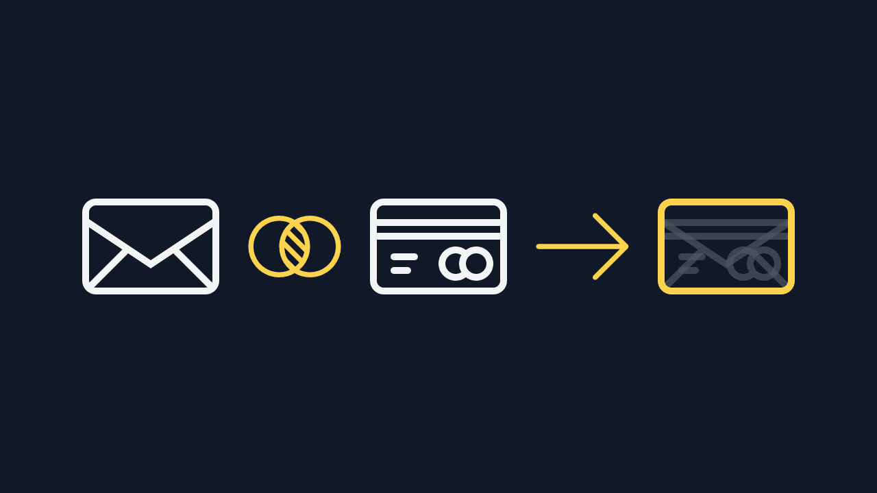
The email and credit card share the same body:
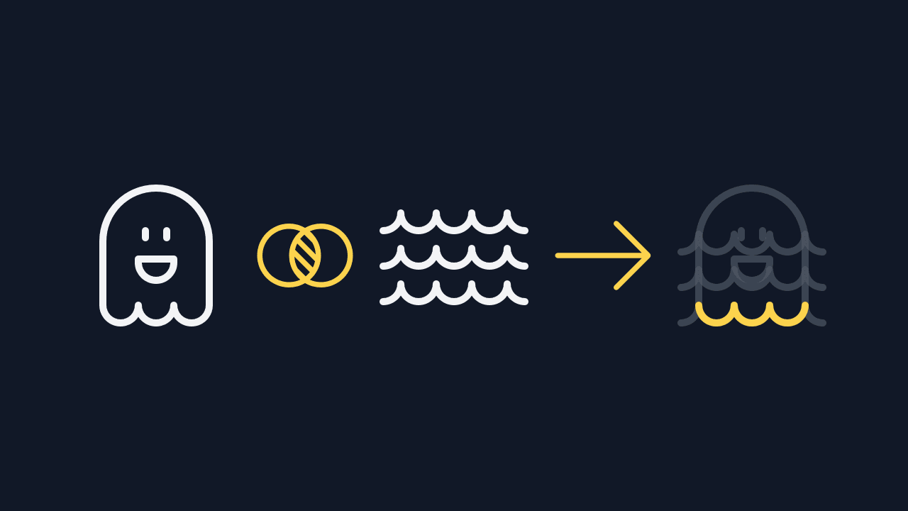
The feet of the ghost are from the waves icon:
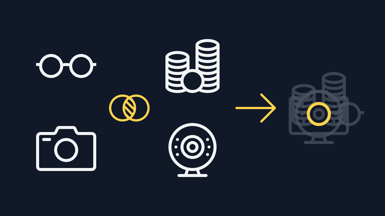
Many circles intentionally have the exact same size:
None of these constraints are absolutely necessary to create a set. They help define the initial direction of an icon. The more similarities there are, the more the icons look like they belong together. If you combine icons from different sets, these differences make them feel inconsistent.
My goal for Lovelicons is to offer as many of the icons needed by most projects as I can. Do you use icons in your projects right now? I’d love if you could reply to this message with a few screenshots of your interfaces. Show me what icons you need and I’ll draw a version that fits with the set.