My design turned out worse than I thought
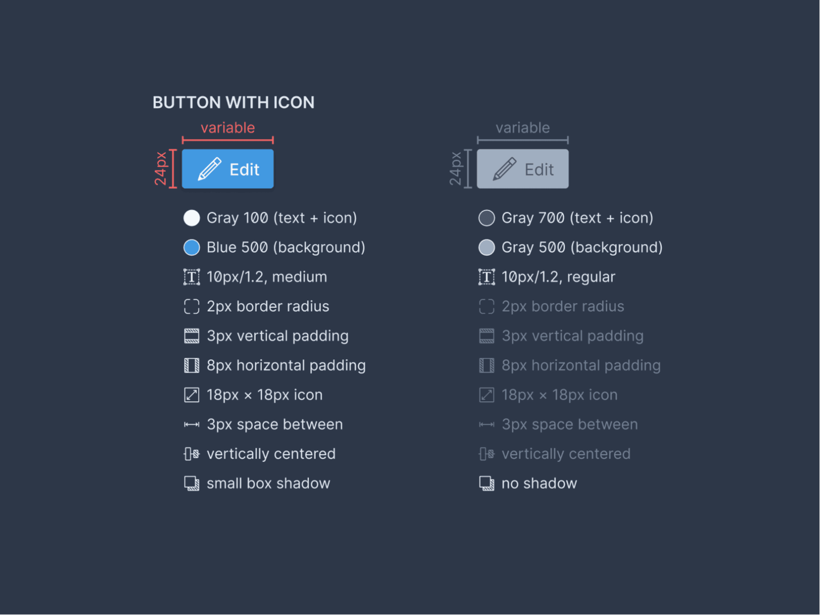
Now that we know what we want the next version of our product to look like, we can finally start implementing it. Trying to make our lives easier, I am compiling a styleguide we can follow to build the components. The guides look something like this:

The guides show all values that are necessary for the components to look as intended. I was pretty proud of how they came out. Developers won’t have to dig through layers in Figma, possibly missing one or two of these values. It seemed pretty ideal.
Since we will use some components in other projects, we are creating a component library. To make it more useful, we are using Storybook to build interactive documentation from it. That way, others can explore the full catalog and see what the components can do.
The bad part? My beautiful buttons look terrible in the browser. They seem way too tiny, the text isn’t very readable, and the icons look almost unrecognizable. The buttons are nowhere near as nice as they appear in the guide.
We can fix all this with a few adjustments, but my expectation was definitely much higher. This exercise is an argument for jumping to code and the browser much sooner. Design tools show styles differently than browsers. The sooner we work with the real thing, the sooner we can confirm if everything works out how we expect.
Storybook is an excellent tool for that. We can build our components right there and even combine them into larger units. Fixing my “beautiful” mockups is going to keep me busy for a few days now.
What other tools should I look at to make sure my designs work well everywhere (and not just in Figma)?