Use dad jokes to get better at design
We can design better pages and screens if we use real data when creating our mockups. Using “ideal” content could even mask issues our design cannot handle. If we use Lorem Ipsum or joke content, we miss opportunities for creating better designs.
Earlier this week, I published a post on designing with ugly data. It explains how to spot problems with a design and how “ugly” data helps us fix them early in our design process. If you learn how to spot these issues, you will be able to cover them in your designs before writing any code for it.
I also released a Sketch-plugin that replaces texts with dad jokes.
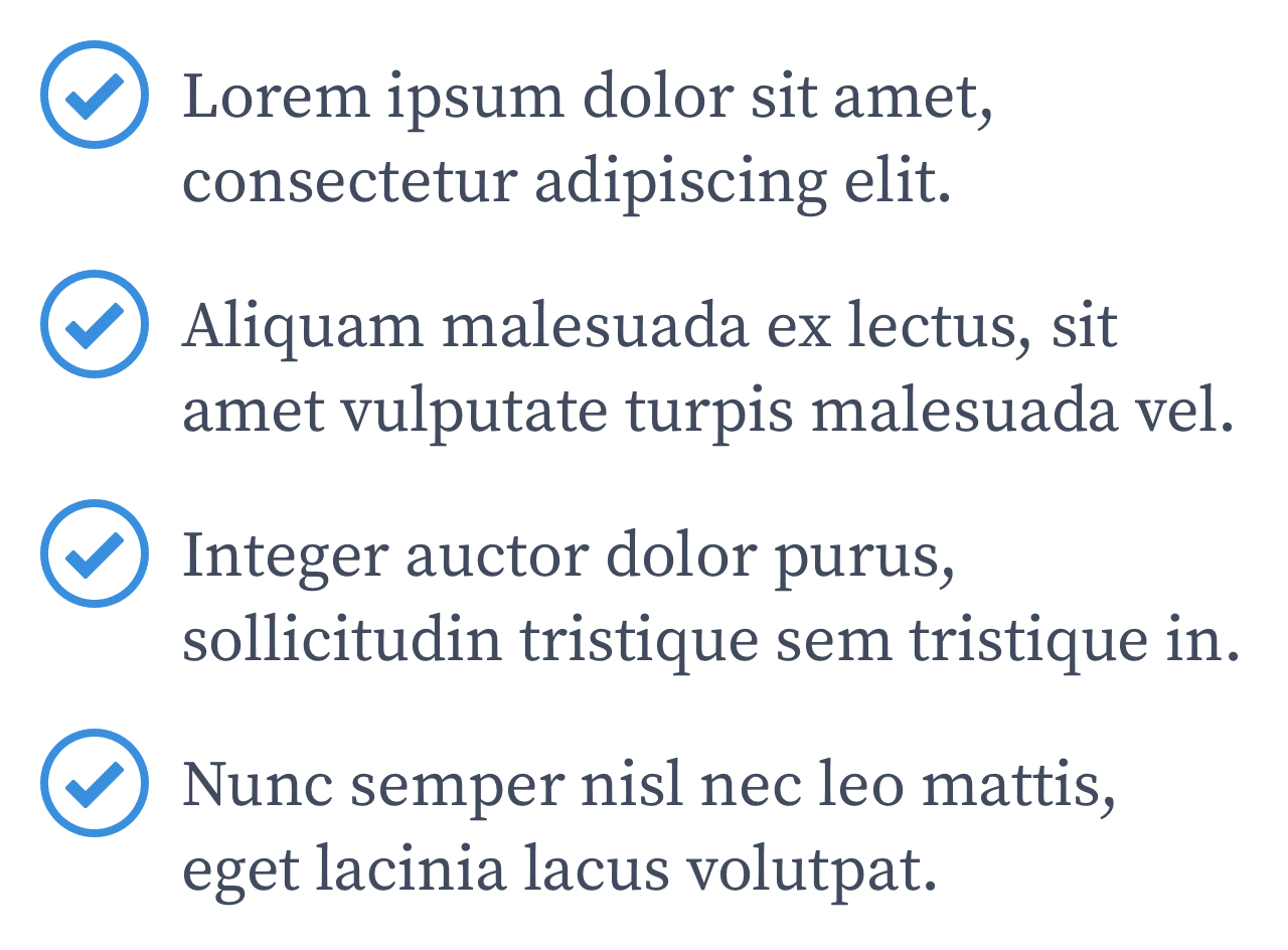
Without sketch-dadjokes:

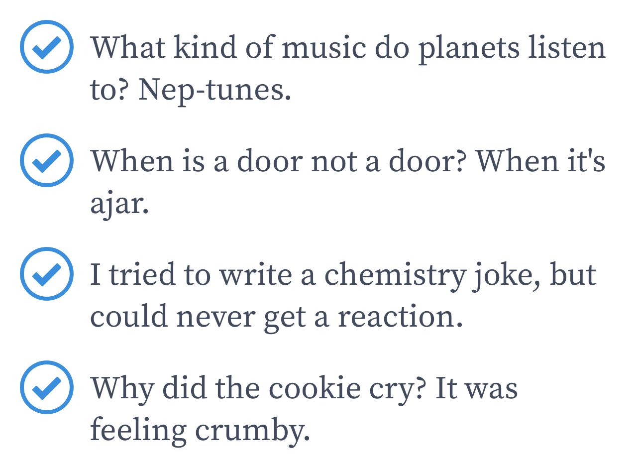
With sketch-dadjokes:

Granted, this does not give you the same benefits that designing with real content would. It’s a silly little thing, but it might be good for the occasional chuckle. It definitely beats Lorem Ipsum in terms of usefulness. I found out Sketch offers a JavaScript-API to build plugins and just had to do something with it.
As a user of Sketch, I can now ask myself “maybe I can change that” whenever I notice something I wish it did. Don’t you love it when software makes you feel in charge?