Fonts that make you go “agh!iIl1”
Finding good typefaces can be a hassle. How do you know which of the options on Google Fonts or Adobe Fonts are good? To quickly compare typefaces, you can use the string “agh!iIl1”.
I originally picked this trick up from Jon Tan. It reveals some of the details of a typeface and helps us compare them based on those. Let’s run that test string through a few different typefaces:
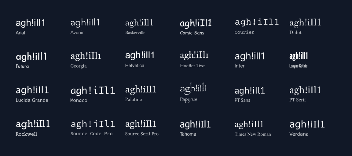
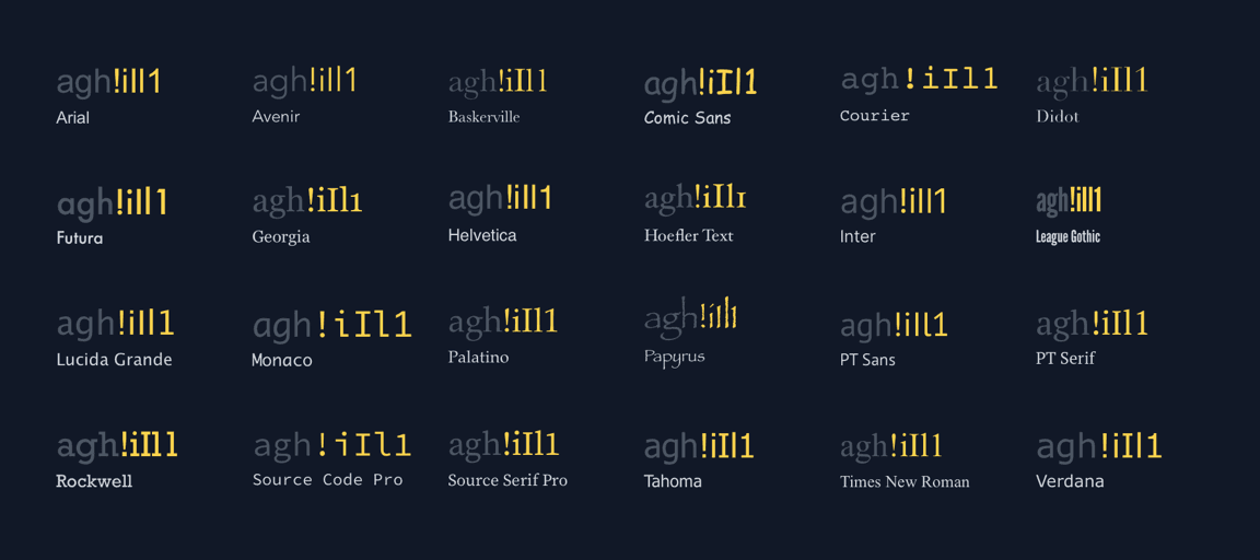
We already get a good comparison of their individual styles and tone. Let’s look at what this overview reveals.
The a shows the weight of a typeface.
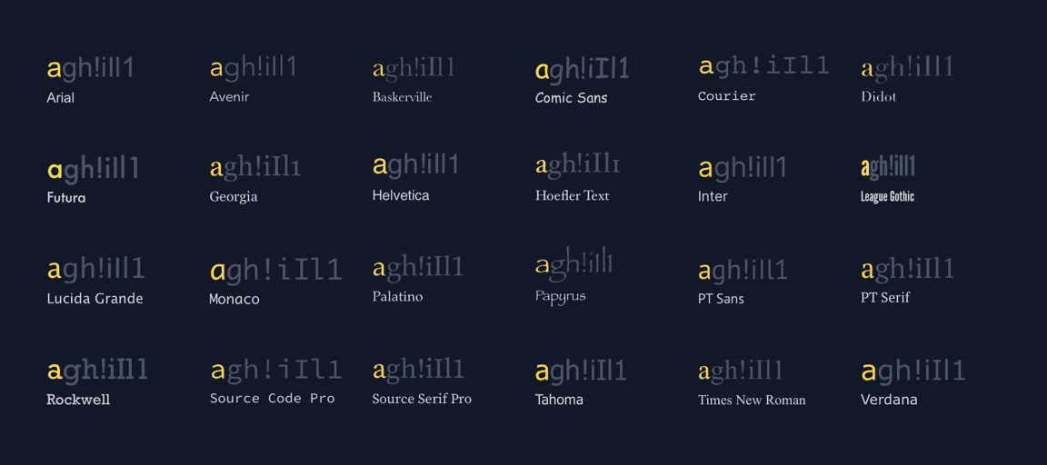
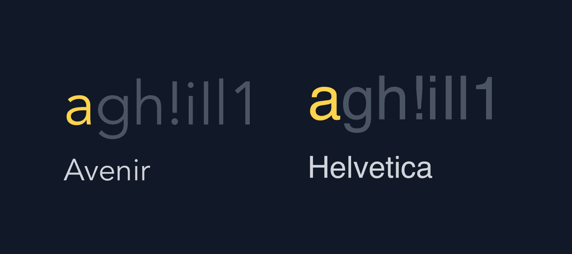
Despite them all being the same font size, the a in Avenir looks much lighter than the one in Helvetica.
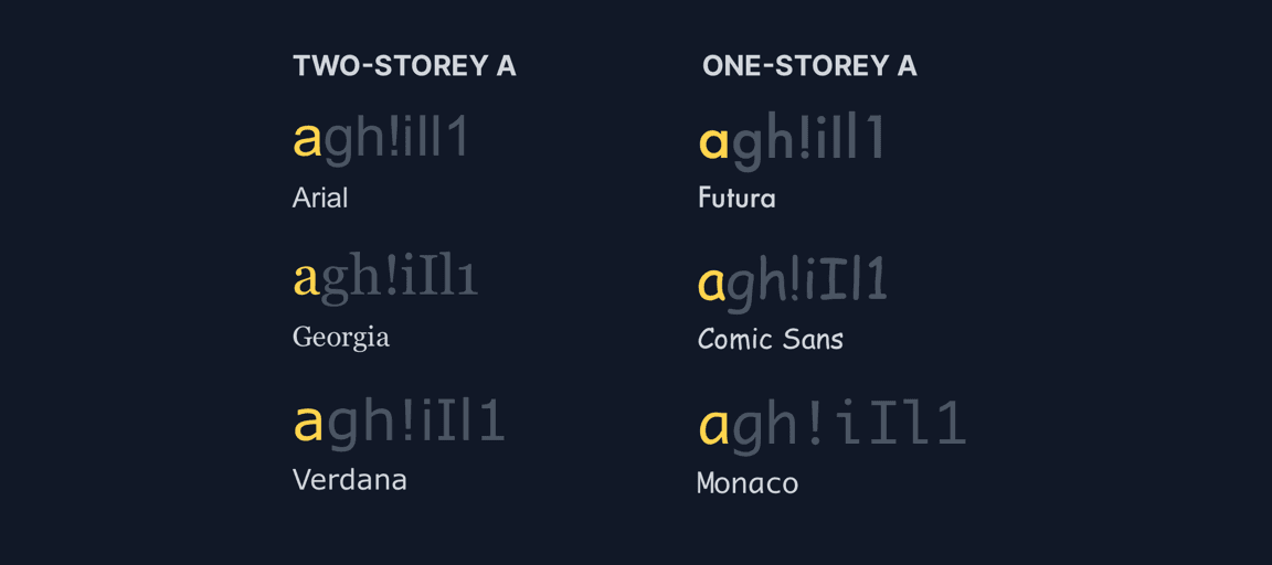
We also see that most typefaces use the two-storey a. Some, like Futura and Monaco, use a single-storey a.
The height of a lowercase letter x (not pictured) represents that typeface’s “x-height”. Descenders are the part of a letter that reach down from the x-height. Ascenders are the part of a letter that reach up from the x-height.
The letters g and h in the test string reveal how the typeface treats descenders and ascenders.
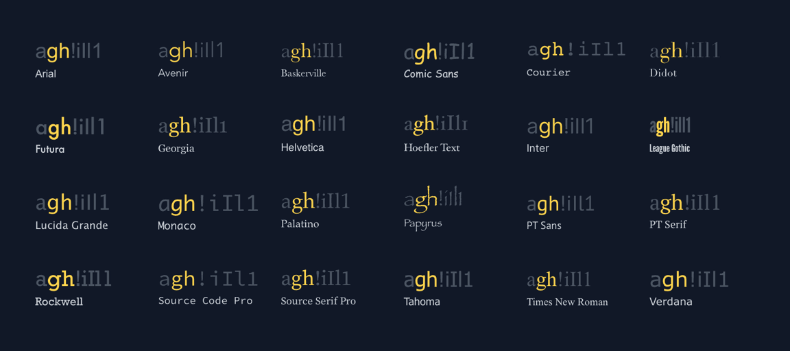
The exclamation mark, lower- and uppercase i, lowercase l, and digit 1 often look very similar. In some typefaces, an uppercase i and lowercase l look almost identical.
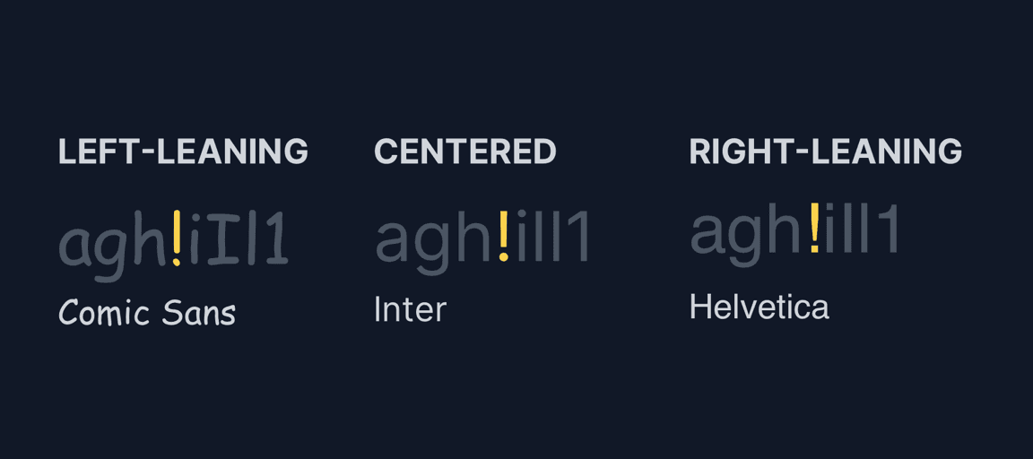
We put the exclamation mark in the middle of the string instead of at the end to see the font’s kerning. Many typefaces center the exclamation mark, whereas it leans to one side in others.
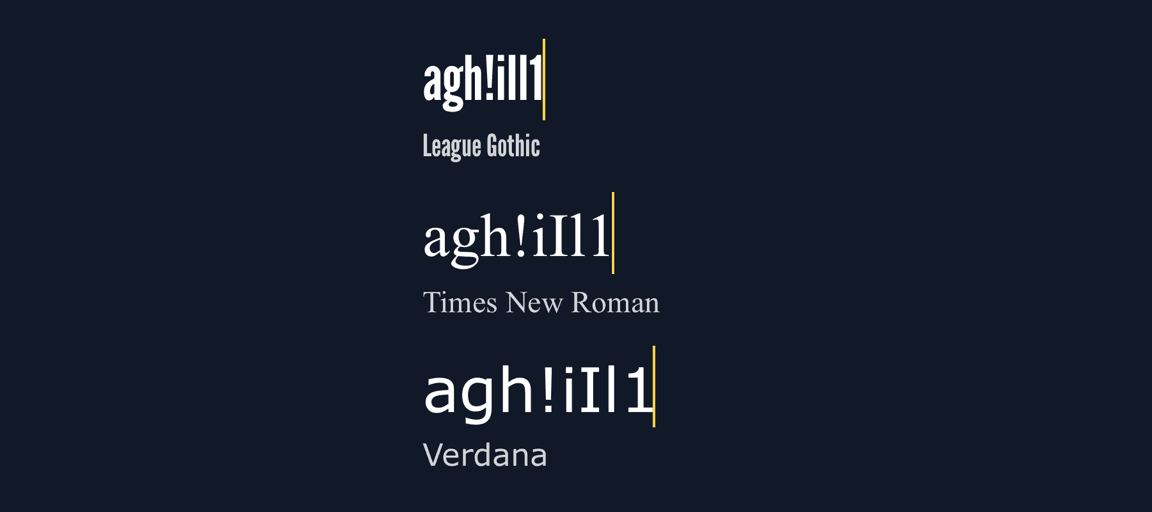
We can also see that some typefaces are much wider than others at the same size.
None of these attributes make one typeface “better” than another. This comparison quickly highlights some of the differences between them. Whether it works for your use case depends on the tone you’re going for.
Happy typing!