How to pick your next project
I am a huge fan of todo lists for organizing my tasks. Lately, those lists are growing a lot faster than I can work on them. While lists are great for leading me through each project, they don’t help me pick what project to work on next.
Todo lists are great when tasks are small and the order we do them in doesn’t matter. Take weekend chores as an example. We need to mow the lawn, take out the trash, and do the dishes. The order we do them in makes no difference. They all take about the same time, and we can get them all done on the same day. Instead of spending energy on picking the next task, we can put them on a list and work through it from top to bottom. Choosing the next step happens automatically, thanks to the list.
A flat list, like a full backlog, does not help us prioritize large projects. Lists make everything seem equally valuable. Often, the more important projects appear further down the list. Working on a backlog from top to bottom is a terribly wasteful idea. To get the most value out of our work, we have to pick the right project to do next. To help us make a decision, we can put them on an Impact-Effort-Matrix.
Instead of looking at our projects as a single list, we can chart them along two axes. One axis is the impact a project can have, the other is the effort it takes to get done.
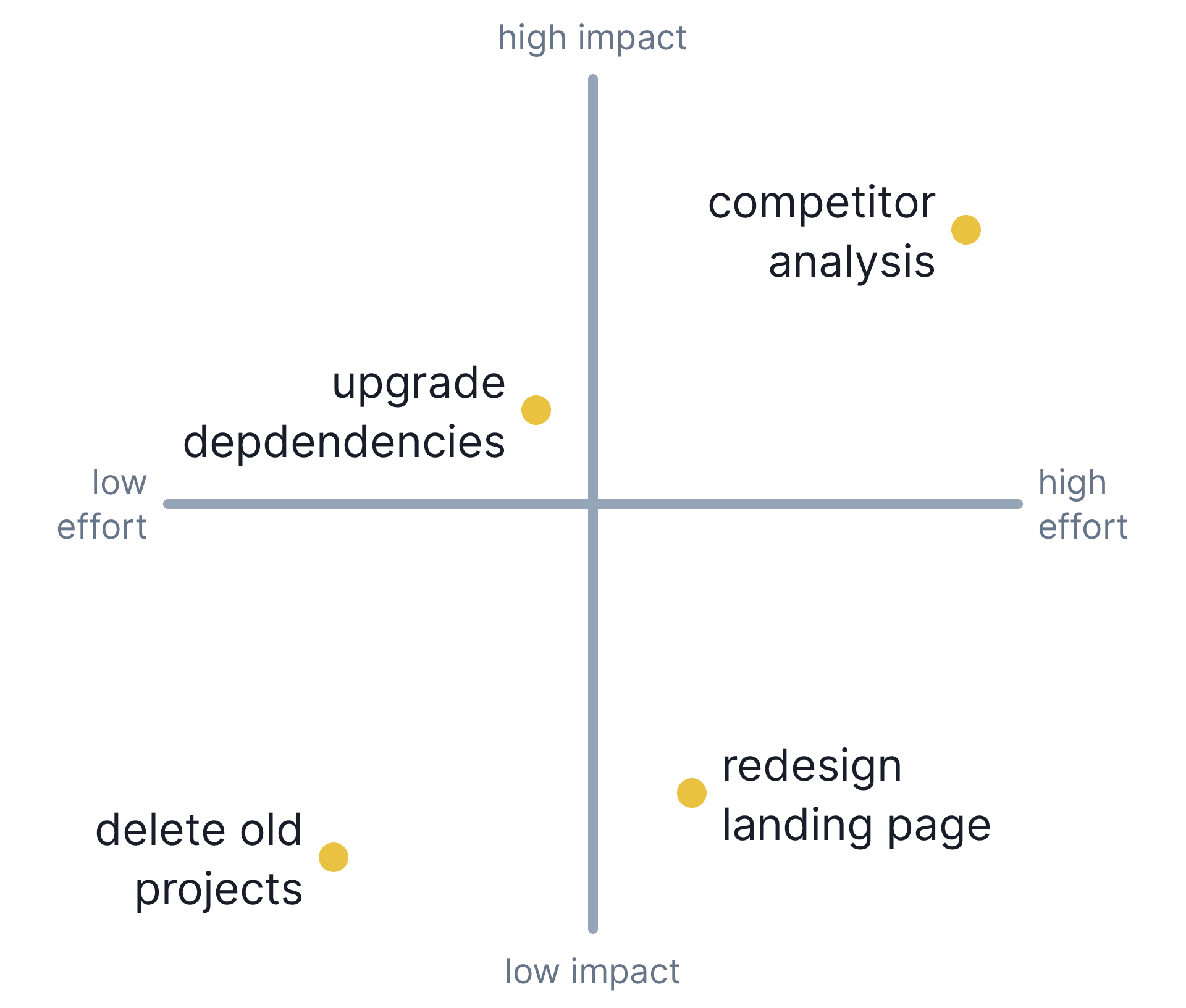
If we chart our projects like this, we can see each project’s importance in relation to the others. Where on the matrix a project ends up shows us how good an idea it is. Each quadrant represents a different category of importance.
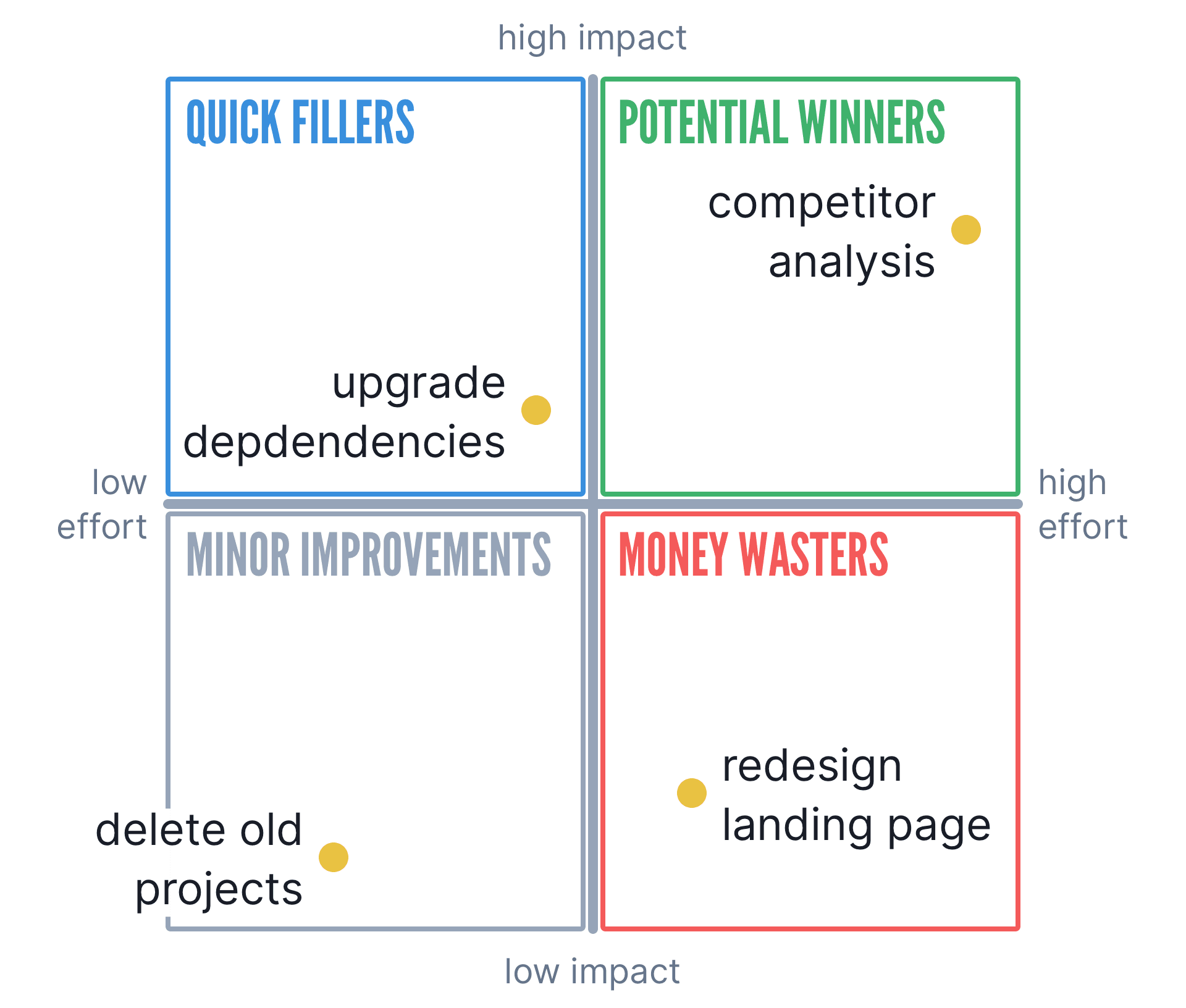
This is not an exact science, because we are bad at estimating both impact and effort. We can still use it as a rough guideline to help us decide.
We’re not limited to look at only impact and effort either. We can chart the same projects based on other attributes and base our decision on many results. A cost-time-matrix can reveal hidden savings. A sweat-joy-matrix could show us how intense and enjoyable projects are.
What attributes we want to look at depends on our situation. Looking at projects based on what attributes are important to us helps us choose better. As fun as some projects could be, this technique brought me back to reality a few times last week. I now try to focus on what is most important. Coding in isolation would often be fun, but it’s not the most valuable thing for me to do.
PS: As my first marketing experiment, I am cross-posting my newsletters to Instagram. I started with the one on how the poop emoji broke my website. This one will go up there tomorrow!