Fat marker sketches are the better mockups
We are about to begin work on a completely new version of our product. Before we can start building, we need to figure out what it is that we want to do. Previously, we would have picked a random idea and started designing every last detail of it. We often skipped the exploration of other ideas, and instead went all in on the first one that sounded okay.
The “mockups” we came up with looked almost like a finished product. Every corner was round, every margin pixel-perfect, every word proof-read. In design reviews, people would focus on the visuals much more than the concepts behind them. The feedback we got was about sizes and colors instead of the underlying ideas.
If we show people too much design, telling them “ignore what this looks like” does not work. Because feedback at this level is not helpful at this stage, we are now doing fat marker sketches instead. These are, unsurprisingly, sketches drawn with a fat marker. They look like this one:
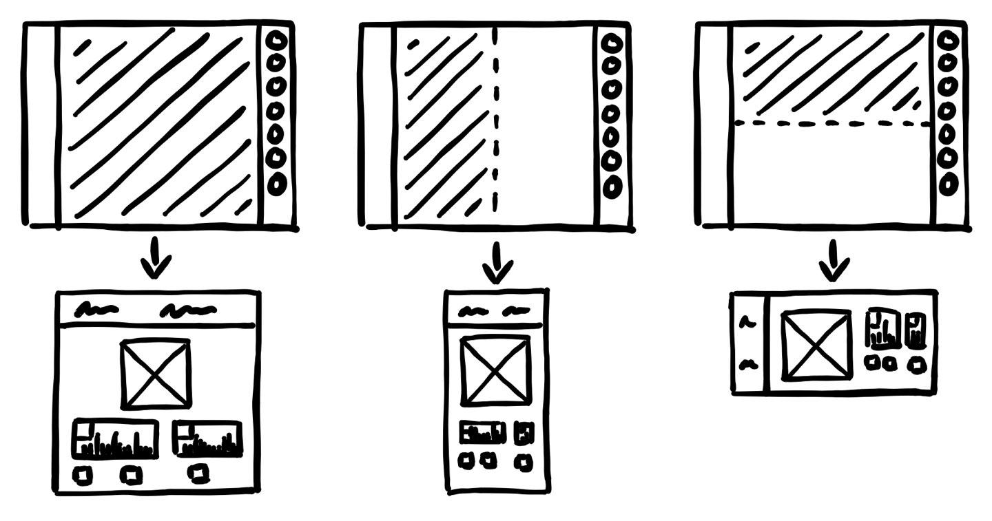
By their nature, fat marker sketches cannot contain a lot of detail. They focus on explaining a concept, with no visual design at all. A fat marker sketch shows just enough for us to explore if an idea would work.
Early into a project, trying to make everything pretty is a waste of time. We could spend hours designing the most beautiful button, only to find out that a button won’t solve our problem. Fat marker sketches help us answer the most important questions quickly. Where do elements need to go, and what happens when we interact with them?
This has already saved us a lot of time. We now have a much clearer picture of what we need to build, even though that picture does not have a lot of detail.